The right combination of colours is one of the fundamental keys to achieving a perfect look and defining your style.
Although knowing how to combine them is not a science, nor is it something random, so today let’s understand the simple guide that will help you not make mistakes when choosing what to wear.
Combining colours is a task that can be difficult for some people. Others, on the other hand, carry it inside, and without any rule, they combine colours in risky ways and always with good results.
For those who combine colours, it seems impossible and fill their house with beige, you have to keep reading.
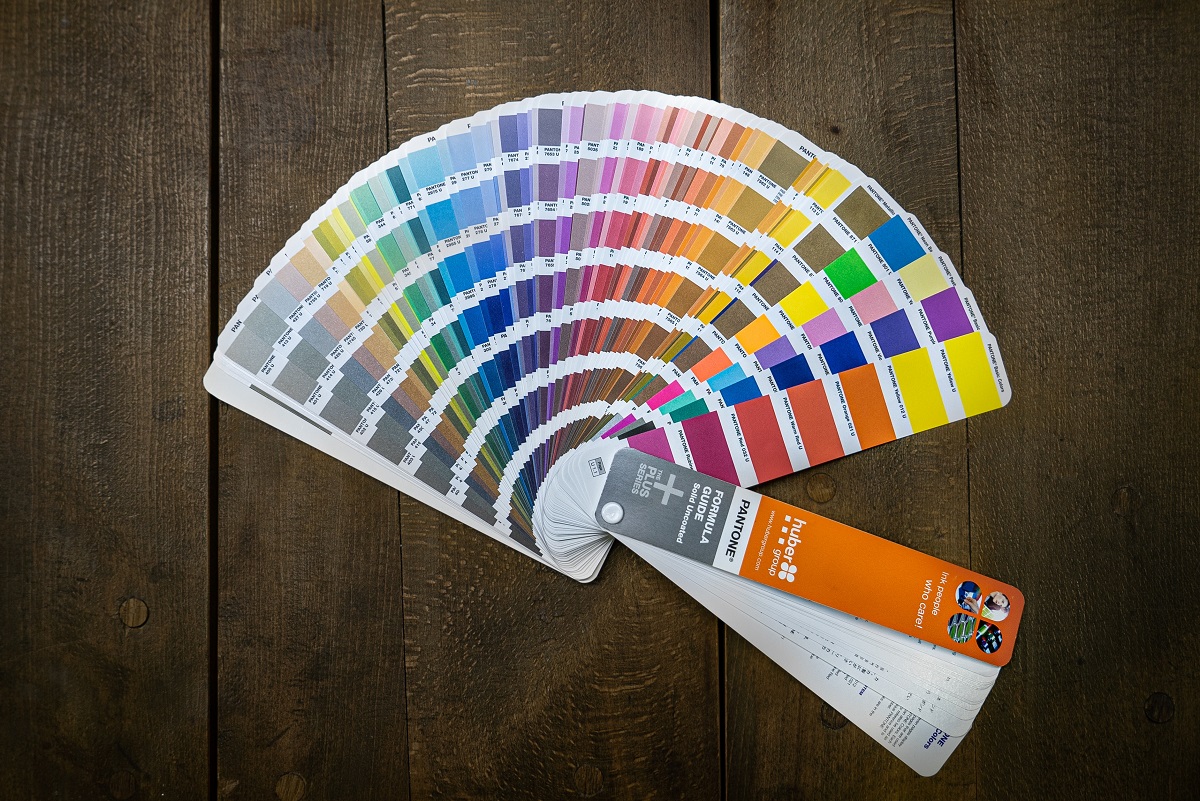
It happens to many of us that if you do not know how to combine colours, from the walls to the accessories, it is a super difficult task. If you want to know about the colour wheel picker, a very useful tool in decoration.
This is made up of 12 different shades, where half are considered cool colours and the other contains warmer tones. In addition, the wheel is classified into Primary Colors, Secondary Colors and Tertiary Colors.
Next, it is the best tip to achieve perfect colour combinations to apply throughout your house and of course in your bedroom.
If you are looking for colour combinations on the internet, the first thing you will find will be many explanations about the interactive colour wheel.
You may recognize it because it is very popular in art and design studios, and it is a circle that shows the colours that are visible to the human eye, arranged according to their hue or tone.
- Primary. Those that no matter how much you mix colours, you can never get them. They exist as such, and the mixture of these forms the rest of the colours that give us so much joy. Those colours are: YELLOW, RED (magenta), BLUE (cyan)
- Secondary: Those colours that are formed by mixing the primary colours: PURPLE, GREEN, ORANGE
- Tertiary: Those colours that are obtained by mixing the secondary colours.
- Monochromatic spaces: Choose a colour from the colour wheel and its lightest and darkest tones for the same room. With this simple rule, you will make the eye travel through space without interruptions in an integrated environment. Monochromatic rooms in cool tones evoke tranquillity, serenity and quiet, ideal for bedrooms, while those with warm colours allude to energy and emotion. There is no way to get confused because the same colour is the guide to choosing from the furniture’s bedding.
- Analogous Colors: Choose two or more colours next to each other on the colour wheel chart, and you will achieve an analogous palette. As in the previous case, this strategy gives the eye a harmonious experience.
- You will get rooms out of the same nature; think of a sunset, the colours of autumn or a landscape where a lake, forests, and mountains meet. Enrol in a landscape design course for greater knowledge about this.
- Complementary Colors: Choose two colours that are directly opposite on the colour wheel. This combination is interesting because, even though contrast is generated due to the opposition of the colours, it makes sense to the eye.
- The result is a coherent and striking environment. You can use the colour you like the most in most of your bedroom and apply the opposite in decorative accessories such as cushions or blankets.
- Triadic Colors: Choose three colours from the colour wheel separated by the same number of colours. An equilateral triangle should be formed, as shown in the image below. This combination generates vibrant and energetic environments due to the diversity of tones, so the key is to create a good balance.
- One colour predominates and the other two accompany accessories and decorative pieces. Mostly recommended to choose soft colours and not so saturated to avoid a circus look.
- A good idea is that the bed and bedroom furniture are the predominant colours and that the other colours are present in decorative paintings, lamps and details. The bedding You can follow the range of the dominant tone to avoid chromatic chaos.
- Complementary Split Colors: To achieve this combination, you must choose a colour and two of those next to its complement. Of course, you can choose the tones of those colours and not follow them to the letter. Finally, it also has to make sense to you and those who inhabit the spaces.
Latest Posts:-